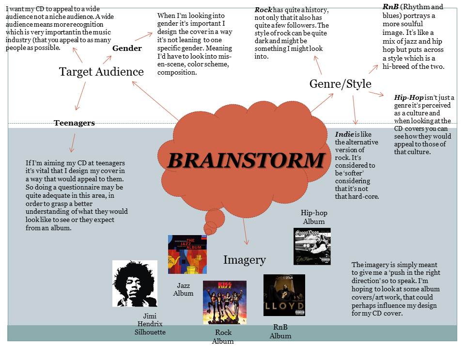
TARGET AUDIENCE RESEARCH
What I hoped to achieve in those analysis
are a number of understandings to do with various styles and types of CD
covers. This would help me when it comes to production of my own CD cover. I
looked at the composition and stylings of each individually.
From looking at the CD covers I selected I think I’m going to
try and target teenagers, reason being that I feel like I would know more of
what a teenager would expect, especially with me being of that age group. The
things they would expect is good composition, brightish colors and good text. It
breaks down into little sub-catergories how ever. For example a 15 year old
girl may expect to see bright colors and a beautiful musician (e.g. Beyonce) on
the cover, reason being at this age they look up to these kind of celebrities
as role models. The beauty, the fashion everything. On the other hand we may
have a 17 year old male who’s into street rap and wants to see their ideal
rapper looking like a ‘thug’ with dark colors and baggy clothing. The style
various from artist to artist and from audience to audience. When you’re doing
teenagers you have to make it very clear at whom you’re trying to attract. The
CD cover I liked the most was the Snoop Dogg album ‘Doggystyle’. I liked how it
went out on a limb and crossed the line with it’s cheeky references and
explicit implication. This kind of thing adds attitude to a cover. Also the
color composition was composed in a way which took to my liking. I liked how
the designer/illustrator made it in a cartoon comic strip kind of style, as
appose to Eminems CD cover ‘recovery’ in which the photographer had think about
the composition of the shot. I think I’ll be using a mixture of both, but when
it comes to final production I’ll decide on which method works best.
Test Shoot (1)

This is the first shot I took in the green room. This shot was supported by artificial light from the actual room and was taken with the central focus method in a mid-close up shot. I didn't like the aspect of this shot to much but I thought It'd be nice to refer back to incase I may gather a similar idea based around the concept of this shot. For this shoot we used a D-SLR camera (Canon EOS 600D). The setting for this shot consisted of it not being set on flash. The camera designated to be set on automatic. For this shot however, it required me to focus the camera before I could even take the shot.
Test Shoot (2)

This shot I wanted to test the quality of aprerture and focus so I did a close up of my subject. I think this came out really good. The clairty of the shot is impecable. I would definately take into consideration using a close up shot for my final design. The flash was not set for this shot, but there was a great use of studio lighting whihc is why there is no trace of a shadow on my subjects face.
Test Shoot 3.

Model Contract

This is the model contract I had my model sign for before I did my photo-shoot. The idea behind doing this is so that I get permission from my model for me to take pictures and use them as I please for my CD cover. This is what would be done in the media industry when creating CD covers, posters, advertisements or anything that uses something of someone (visibly or verbally).
My Final Design

This is my final design. This design was based on one of my previous designs I uploaded before (with a few modifications). The colour stayed the same which was 'black and red' and also the amount of tone and shadowing that would be used. The title for the album also stayed the same
My Second Design

This is my second album design. This one was more spontaneous, it had no influence as such this was created by pure feeling and because it was made by just instinct I feel it has more feeling and emotion to it rather than my other CD covers. The idea behind it was for it to appear mysterious and elusive. I wanted the audience to have the feeling wanting to see the full face but not be able to because both images of the artist on the cover is from the side. This creates a sense of mystery, hopefully it gets portrayed as the audience wanting to know who he is music wise. This is a technique I think would work with sales. In order to take the picture, I got the camera in a close up angle. I cut the face in half and I then transformed it to a black and white image and left it that way.
Contact Sheet

